St Paul’s Cathedral Unveils New Visual Identity Designed by Pentagram
Published by AINave Editorial • Reviewed by Ramit
The prestigious St Paul’s Cathedral in London has unveiled a significant rebranding effort, spearheaded by the renowned design firm Pentagram, under the guidance of Domenic Lippa. This refresh marks an important development for a building famed for its resilience during the Blitz and its role as 'The People's Cathedral' in contemporary society. Pentagram’s approach focused on intertwining the cathedral’s rich history with a modern aesthetic, aimed at enhancing accessibility for both local visitors and worshippers.
The New Wordmark Design
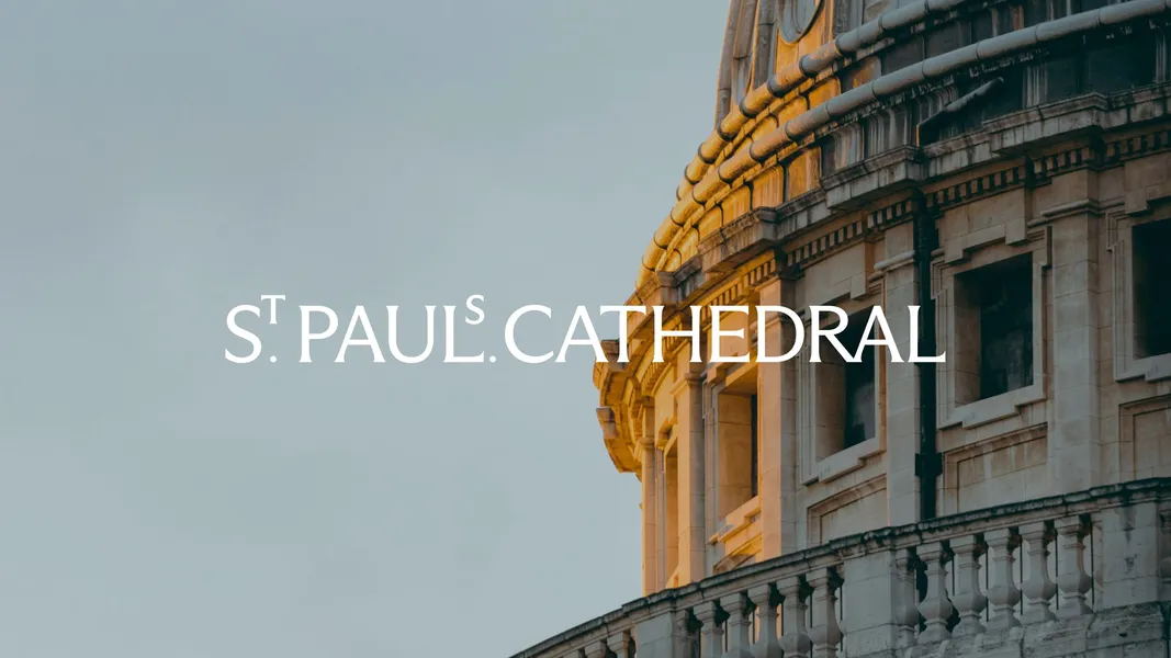
At the core of this redesign is a newly crafted wordmark that reflects the architectural elegance and historical significance of the cathedral. Inspired by engravings and carvings found within the structure and its Crypt, the wordmark employs an elevated 'S' and 'T' to evoke typographic elements seen in a book housed in the cathedral’s library. As Lippa explains, the team's ambitious vision was to create a modern emblem while honoring the building’s heritage. The careful balance between modern design and traditional elements is intended to resonate with all who interact with this landmark.
Typography and Color Palette
The typography chosen for St Paul’s brand is both contemporary and distinctive. The primary typeface, Dinamo Arizona Flare, is complemented by bespoke ligatures, while Raleway serves as a secondary typeface. Noteworthy is the vibrant color palette, inspired by the cathedral’s interior, reflecting the tones of its floors and walls as well as the dazzling colors of its ceiling mosaics. This choice contradicts expectations for a sacred site, aiming instead for a welcoming and warm atmosphere.
The strategy behind this transformation involved collaboration with Simple Revolution's Bert Preece and Adam Kaveney, who contributed to developing a verbal identity that encapsulates the cathedral's essence as an open and inclusive space. Lippa's firm conviction that the cathedral embodies a unique personality drove the creative process, emphasizing fluidity and dynamism in the new identity.
Community Impact
With its new branding, St Paul’s Cathedral positions itself as not only a historic monument but as an adaptable community hub. As emphasized by Lippa, the intent is that the identity surprises and delights everyone—staff, volunteers, visitors, and worshippers alike. This strategic rebranding grooms St Paul’s for a modern audience, facilitating deeper connections among the diverse groups that visit the cathedral, ensuring it remains a relevant and integral part of London’s cultural fabric.
In summary, the initiative taken by Pentagram represents a thoughtful intersection of history and contemporary design, encapsulating the cathedral's role in society today. This new identity not only respects the past but also embraces the future, encouraging participation from all segments of the community.